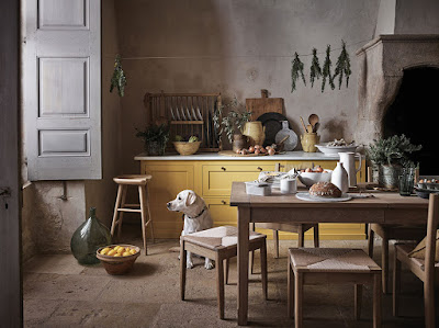
This interior photograph looks like a Dutch painting, doesn't it? To see all the detail and study it, click photo to enlarge. It is actually an advertisement for an English brand called NEPTUNE. Their spring collection is all about the neo-rustic style in English country houses. I might have to save each and every photo to study more closely and swoon over. Yes, I know. I find the best things to share with you. You're welcome. xo


4 comments:
I would definitely feel right at home in that kitchen. xo Laura
It's beautiful and whomever the set designer, (or whatever they call people who compose a shot for the camera), is they certainly have created just that ambience.
I did think it was a painting until you said otherwise.
I enjoyed the link showing the firm that created that beautiful kitchen. All of the images shown look like paintings.
Thanks for finding beautiful and interesting items for us to enjoy.
xo,
Karen
Post a Comment